
The future of the internet is mobile.
Websites that are not mobile-friendly will soon be a thing of the past. With over half (54.4%) of all internet traffic coming from mobile devices, it is more important than ever to make sure your website looks great and functions properly on smartphones and tablets.
If your website doesn’t look good on a smartphone, your users will leave and go to a competitor’s website that does.
So what does it mean to be mobile-friendly? How can you check if your website is optimized for mobile traffic? Most importantly, why is it important that your website is mobile-friendly?
In this post, we will answer all those questions and give you some tips on how to make a website mobile-friendly.
What Does It Actually Mean To Be Mobile-Friendly?
A mobile-friendly website is easy to use on a smartphone or tablet. This means that the layout is easy to navigate, and buttons and links are appropriately sized to be used with a finger.
Mobile-friendly sites are well-optimized and use a particular design to serve the needs of mobile users. For instance, mobile-friendly websites also tend to load quickly, as users are often on the go and don’t have the patience to wait for a slow website to load.
Overall, the goal of a mobile-friendly website is to provide users with a positive experience that is optimized for the device they are using.
How To Check If Your Website Is Mobile-Friendly
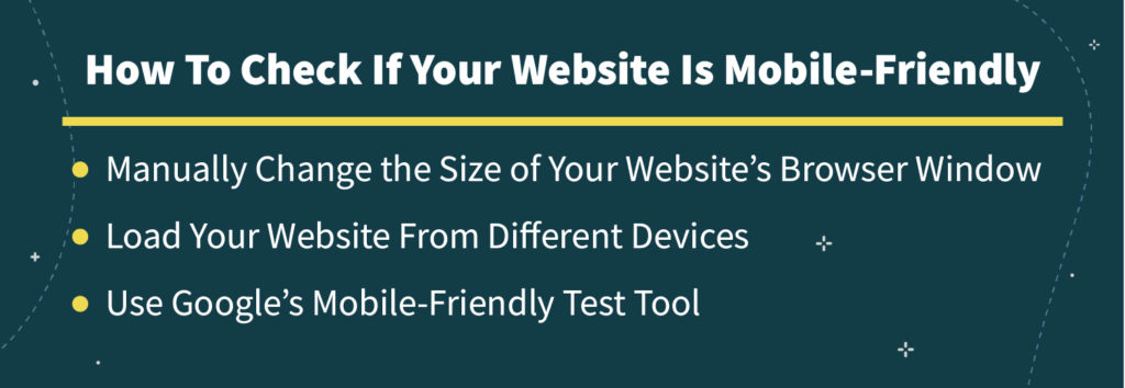
Checking if your website is mobile-friendly is pretty easy due to the many approaches available. Here are some ways you can test your website’s mobile-friendliness:
Manually Change The Size Of Your Website’s Browser Window
The quickest and easiest way to test if your website is mobile-friendly is to just open it on your smartphone yourself. Simply open your website on a desktop browser and resize the window to be as small as a smartphone. If your website is easy to use and navigate, then it is most likely mobile-friendly. If not, you will need to make some changes.
Load Your Website From Different Devices
Nothing beats good ole’ fashioned testing. If you have access to different types of mobile devices, load your website on each one and see how it looks and feels. This will give you a good idea of how your website appears on different screen sizes and can help you identify any areas that need improvement.
Use Google’s Mobile-Friendly Test Tool
Google has a great free tool that will analyze your website and tell you if it is mobile-friendly. All you need to do is enter your website’s URL and the tool will do the rest.
The Mobile-Friendly Test Tool will give your website a score that categorizes how mobile-friendly your website is. It will also provide a list of current issues and actionable items so you can fix and improve your website’s mobile-friendliness.
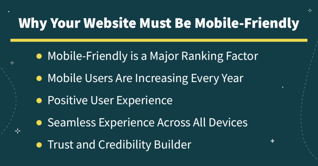
Why Your Website Must Be Mobile-Friendly
It’s always a wise idea to understand the many benefits that you can reap by making your website mobile-friendly. After all, why put in the extra effort if there’s no real payoff?
Here are some key reasons why it’s important to have a mobile-friendly website:
Boost ROI and Conversion Rate
If your website is not mobile-friendly, you will lose potential customers and revenue. Research has shown that 1 in 2 users will leave a website that is not mobile-friendly and go to a competitor’s site.
Mobile-Friendly is a Major Ranking Factor
Google has stated that they are now using mobile-friendliness as a ranking factor in its search algorithm. This means that if your website is not mobile-friendly, you’ll appear lower in the SERPs than competitors who are, and it will be harder for people to find you online.
Mobile Users Are Increasing Every Year
As more and more people adopt smartphones and tablets, the number of mobile users is increasing every year. Over half (54.4%) of all web traffic now comes from mobile devices.
This trend is only going to continue, so it’s important to make sure your website is prepared.
Besides the many obvious benefits for you and your business, it also works in your users’ interest, which still comes back to benefit you in the long run.
Positive User Experience
A mobile-friendly website provides users with a positive experience that is optimized for their devices. This results in happy users, which leads to more recommendations and positive testimonials, which leads to more traffic and conversions for your website.
Seamless Experience Across All Devices
Having a seamless user experience from device to device is also becoming more important as people use multiple devices throughout their day.
According to Google, 90% of people move between screens across devices to accomplish a task. This means that people often start their journey on one device (usually a mobile phone) and then move to another device (usually a desktop computer) to complete it. For example, many people will casually research their choices on a mobile device before completing their purchase and checkout on their laptop.
Trust and Credibility Builder
Lastly, it also helps your users see you in a positive light. Trust and credibility go a long way when it comes to nurturing and fostering positive relationships with your users, and creating a mobile-friendly website is a step in the right direction.
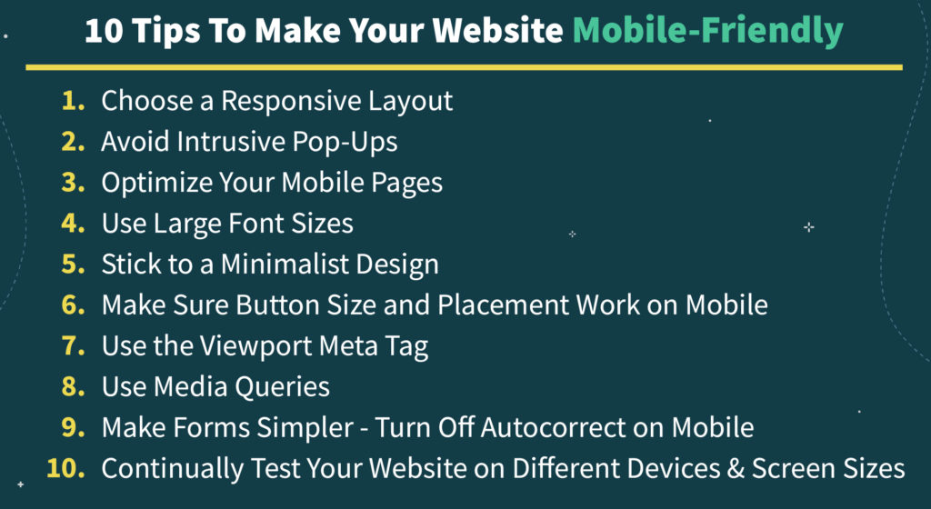
10 Tips To Make Your Website Mobile-Friendly
Now that we’ve gone over what it means to be mobile-friendly and why it’s important, let’s take a look at some tips on how to make a website mobile-friendly.
1. Choose A Responsive Layout
A responsive layout is a must if you want your website to be mobile-friendly.
It allows the website to adapt and change its layout based on the device it is being viewed on. Also, with a responsive layout, side-scrolling and zooming are no longer necessary, which makes the experience much smoother for mobile users.
This means that your website will look great and be easy to use no matter what device your users are on.
2. Avoid Intrusive Pop-Ups
No one likes pop-ups, especially on mobile. They are intrusive, very difficult to close on a small screen, and just plain annoying. They’re also difficult to get rid of – a pop-up with a hard-to-see or non-existent close button is aggravating and the hallmark of a poorly-designed mobile website.
If you have pop-ups on your website, make sure they are non-intrusive and can be easily closed on a mobile device.
3. Optimize Your Mobile Pages
Today’s customers want everything to be fast and easily accessible, and if it’s not, they will quickly move on to something else.
The same goes for mobile users. If your website speed is slow and laggy, your users will leave and find a faster website.
If you want to keep your mobile users happy so they stick around, you need to make sure your website speed is up to par.
Here are a few ways to do that:
- Use a content delivery network (CDN)
- Optimize your images
- Optimize your website code
- Use browser caching
- Minimize CSS files
For a full breakdown of how to optimize your website speed, check out our full guide on common technical SEO issues.
4. Use Large Font Sizes
One of the main differences between desktop and mobile devices is the screen size.
Mobile screens are much smaller, which can make it difficult to read small font sizes.
To make your website mobile-friendly, use large font sizes that are easy to read on a small screen. This will make your website much easier to use for mobile users. Once you have done this, don’t forget to test it out on a few different devices to make sure it looks good and is easy to read.
5. Stick to a Minimalist Design
Less is more when it comes to mobile design.
A minimalist design is much easier to navigate and use on a small screen. Plus, it will help your website load faster, which is always a bonus.
So, when you are designing your mobile-friendly website, stick to a minimalist design and only include the essentials such as your branding, navigation, and content.
You can always add more bells and whistles later, but for now, keep it simple.
This will make your website much easier to use on a mobile device and ensure that your users have a positive experience
6. Make Sure Button Size and Placement Work on Mobile
One of the most important things to consider when making your website mobile-friendly is button size and placement.
On a desktop, it’s easy to click on a small button or in a difficult-to-reach place, but on mobile, it’s much more difficult.
49% of mobile users use their thumbs to navigate and click on elements that are within their thumbs’ reach. That means that any element placed in the upper corners of your website will be a struggle to reach for most users.
To make your website mobile-friendly, make sure all buttons are large and placed in the middle of the screen where they are easy to reach.
And, if you want to take it a step further, you can add a “hamburger” menu icon in the upper corner of your website that will expand to show all of your navigation options when clicked.
This is a great way to make sure your mobile users can easily find what they are looking for without having to search through a long list of menu items.
7. Use the Viewport Meta Tag
The viewport meta tag is an HTML element that tells the browser how to adjust the website’s dimensions and scaling to fit the width of the device’s screen.
Without this tag, your website will not be responsive and will not adjust to different screen sizes.
To make your website mobile-friendly, you need to add the viewport meta tag to the HTML code of your website.
Once you have added the tag, be sure to test your website on different devices to make sure it is responsive and looks good on all screen sizes.
8. Use Media Queries
Now a popular technique, media queries were designed to make the responsive design simpler and more effective.
Media queries are responsive CSS code for all screen sizes. It allows you to specify different styles for different screen sizes using specific rules.
For example, you could use a media query to make sure your website’s font size is large enough to be readable on a mobile device.
Or, you could use a media query to hide certain elements of your website on mobile devices to make the design simpler and easier to use.
Media queries are a great way to make sure your website looks good and functions well on all devices.
9. Make Forms Simpler – Turn Off Autocorrect on Mobile
Another important thing to consider when making your website mobile-friendly is forms.
Forms are often long and complex, which can be difficult to fill out on a mobile device.
To make your forms simpler and easier to use on mobile, turn off the autocorrect function. This will prevent the keyboard from changing what you type and make it easier to fill out your form.
In addition, make sure all form fields are large enough to be easily clicked on mobile devices.
If you have a longer form, consider cutting down on the number of fields or breaking it up into multiple pages so that mobile users don’t have to scroll through a long list of fields.
10. Continually Test Your Website on Different Devices and Screen Sizes
Finally, as your work is never done, continually test and optimize your website on different devices and screen sizes, even after development.
Mobile devices are constantly changing and evolving as new devices and screen sizes and continuously being released, so it’s important to keep up with the latest trends.
By using the previously mentioned methods, you can test your website regularly throughout its lifespan. When you take this necessary step, you can identify and tackle any potential mobile-unfriendly issues that may arise.
You can take it one step further by testing out every user scenario and optimizing your customers’ journey. Taking this step will allow you to identify any potential bottlenecks and make the necessary changes to keep your website running smoothly.
Make Your Website Look and Perform Its Best On All Fronts
Similar to the desktop, first impressions matter on mobile.
The average user will make a judgment about your website in just a few seconds, so it’s important to make sure your website looks and acts its best.
If you follow the above tips and tricks, achieving that will be much more straightforward.Put these tips into practice one step at a time, and make your website mobile-friendly. To kick your website up a notch, factor in Javascript dynamic rendering so search engine bots can quickly process and index it. Register with Prerender for free today to get started. Your users will thank you for it, no matter their device.


