
Nowadays, mobile traffic accounts for 50%+ of the global online traffic, making it a must to create websites as mobile-friendly as possible.
In fact, this adoption has even changed the way we think about our sites and applications:
- Search engines like Google are now implementing mobile-first indexation, crawling and ranking your pages predominantly from the mobile version
- Software companies, embracing this shift in user behavior, are focusing more and more on implementing progressive web applications (PWAs) to create a seamless experience between desktop and mobile.
- The ecommerce industry has seen staggering growth over the past few years, with global mobile commerce hitting $2.51 trillion in 2025 and now accounting for 60% of all ecommerce transactions worldwide.
To make a website mobile-friendly, there are two main objectives: responsive and fast.
Mobile devices, because of their nature, don’t always have the best connection or fast CPUs, making it a real challenge for these devices to handle JavaScript as efficiently as desktops.
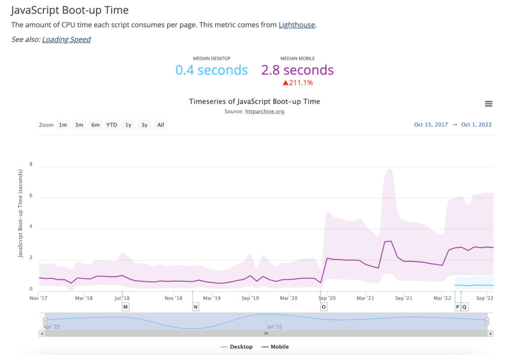
Image source: HTTP Archive
In today’s article, we’ll take a look at some of the best practices to keep top of mind when optimizing your JavaScript sites for mobile devices.
1. Adopt a Mobile Mindset and Set a Performance Budget
Creating a mobile-friendly website comes with a few constraints of its own, so you’ll need to use a different approach if you want to take the full advantage of the format.
To adopt a mobile mindset, there are two things that are required:
- Create a clear process of collaboration between the design and development teams
- Set a performance budget and adhere to it
To make a website as responsive and fast as possible, it’s necessary that the design and development team can agree on designs from the beginning. Allowing developers to request changes to reduce page size, for example.
Also, it’s important that your team has a clear goal in mind while developing the site. For example, the total number of requests allowed per page or the final file size for each page.
A good place to start with this is setting a goal of, for example, 500 KB per page. This restriction will influence a lot of choices, like the number of features implemented and how much JavaScript is allowed per page.
Setting a performance budget is not just useful to avoid creating slow sites that will take longer to optimize, but it will also help your team make decisions faster.
2. Use the Async or Defer Attributes
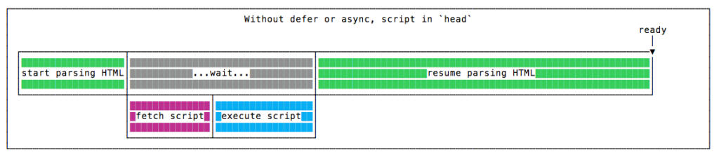
For users to see your website, the browser will need to fetch all necessary files, download them and then use them to build (or render) the site. This process will take more or less time depending on several factors like the device, network connection, server response time, etc.
However, JavaScript files have a significant impact on the performance of the website because it needs to be downloaded and executed before the rest of the content can be parsed, creating a bottleneck in the rendering process.
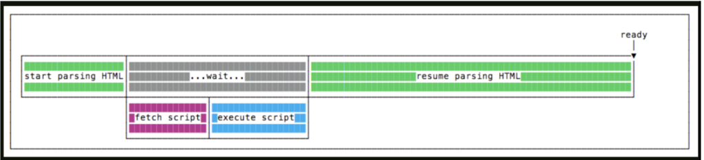
As seen in the image above, once the browser detects the file, it’ll stop all other processes and deal with the JavaScript file. In the meantime, the user is left waiting without being able to interact with the page.
To combat this, it’s been a common practice to add the <script src=”script.js”></script> line before the closing </body> tag, so the browser would parse the entire body before encountering the JS file.
However, today we can use Async and Defer to avoid parser-blocking JavaScript issues.
These are used as attributes for the script element. When both are present, the Async attribute will take precedence over the Defer attribute, which will act as a fallback.
When we use the Async attribute, we’re basically telling the browser to download the JavaScript file in parallel to the HTML parsing, only pausing the rendering process to execute the JS once the resource is available.
This is a great method to shorten the time to first paint, providing a better user experience than a blank page. However, there’s something important to factor in here: Async scripts don’t wait for anything, and nothing waits for them.
An Async script is as independent as it gets, so they don’t need to be executed in order. If script A is first in line, then script B. But if script B downloads first, then script B will be executed first.
Because of this, it’s better used for third-party scripts, like counters and ads, where the order isn’t relevant.
But what if order IS important? Then we can use the Defer attribute. This attribute has two main differences: 1) it’ll download the JavaScript files in parallel as Async, but will wait until the HTML is completely ready before executing…
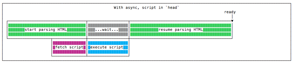
… 2) It will respect the order of the scripts, so no matter which downloads first, script A will always be executed before script B, which can be very helpful if we need to load a JS library and then scripts depend on it.
However, it’s worth noting that if you’re writing modern JavaScript using ES modules (<script type=”module”>), you get Defer behaviour for free. Module scripts are always deferred by the browser. They download in parallel and execute after the HTML is parsed, without needing the attribute. This is one of the reasons modern apps built with native ESM tend to load faster with less manual configuration.
At the end of the day, not blocking the main thread with JavaScript is a quick and very powerful way to improve site performance.

3. Minify and Compress Your JavaScript Files
Minifying your JavaScript file can help you save some precious bytes by deleting all unnecessary elements from your JavaScript code, like whitespace, comments, using shorter names, etc., and a smaller file means less download time, speeding up your site’s load speed.
JavaScript is written by and for humans, so it’s important for developers to use formatting and descriptive variable and function names to make sense of the codebase and be able to debug it later if needed.
On the other hand, machines don’t really need all this extra text, so even a stripped-down JavaScript code can be interpreted well by the machine.
Tools like Terser and esbuild can help you minify your scripts. (If you’ve seen UglifyJS recommended in older resources, note that it doesn’t support modern ES6+ syntax. Terser is the current standard, and if you’re using a bundler like Vite or WebPack, it’s already running under the hood.)
As an example, here’s a simple JS script:
| //This is a comment//This is another comment//Well… minify me thenfunction sayHello(name) { console.log(“Hi ” + name + “!”);} sayHello(“Reader”); |
Here’s the minified version:
| function sayHello(l){console.log(“Hi “+l+”!”)}sayHello(“Reader”); |
In addition to minifying your code, you can enable Brotli compression. Brotli is now supported by all major browsers and achieves around 15–25% better compression than Gzip on JavaScript files specifically. The best approach is to enable both:
- Brotli for modern browsers (served automatically when the browser sends an Accept-Encoding: br header)
- Gzip as a fallback for any older clients
In most cases, your CDN (Cloudflare, Fastly, etc.) or server (Nginx, Apache) handles this with a single config toggle, and there’s no need to compress files manually.
Note: This is different from Obfuscation, which is used to turn code unreadable by humans in order to hide business logic. It could, in theory, reduce file size, but that’s not its main objective.
4. Use Code-Splitting
Although it won’t have any effect on your JS file size, splitting your code into functional modules that are called on-demand or in parallel can have a huge impact on page performance.
Instead of having the browser download a huge JavaScript file with all the code, you can use a module bundler like Webpack and serve your JS in chunks or bundles – to use the correct name – freeing the client from having to download and execute pieces of code that won’t be used any time soon and letting the user interact with the page faster.
Here’s the complete code-splitting Webpack documentation for reference. And while Webpack is still a great option, Vite has become the go-to bundler for most JavaScript projects nowadays. It handles code splitting automatically out of the box and is significantly faster to work with during development. If you’re starting a new project or weighing a migration, it’s worth a look.
5. Remove Unused JavaScript Code
There are two main types of unused JS code:
- Non-critical JavaScript – it’s not used at the top of the content (above the fold content) but can be used somewhere else on the page
- Dead JavaScript – which is JS that’s not used anywhere on the page
This can happen because of many reasons, like temporary test code, residual code from a previous version, etc., and can represent a real issue as the users’ browsers need to download, parse, compile, and evaluate the code for no reason at all, wasting processing and network power.
Be mindful that this is a very common problem, even for big brands. Run PageSpeed Insights on any JavaScript-heavy site (retail, SaaS, media) and “reduce unused JavaScript” almost always appears near the top of the suggestions. The two most common recommendations Google surfaces are “reduce unused JavaScript” and “eliminate render-blocking resources.”
But can we detect more accurately which scripts are not being used? Well, we can use the Coverage Tab from Chrome DevTools.
On the page and with DevTools open, open the Command Menu (Command+Shift+P for Mac and Control+Shift+P for Windows) and start typing coverage. From there, click on the refresh button and wait for it to be populated. Once it’s ready, you’ll see the results on the “Coverage” tab.
The Total Bytes column represents the full size of the file downloaded by the browser, while the Unused Bytes column represents the total size of the code not being used by the page. In many cases, most of the downloaded JavaScript is not being used from the first JS file, and it’s just consuming resources.
Deleting all this unnecessary data will create a smaller JS file and greatly increase the site’s mobile performance.
A note on Core Web Vitals and JavaScript:
In March 2024, Google replaced First Input Delay (FID) with Interaction to Next Paint (INP) as one of its three Core Web Vitals. This is worth calling out here specifically, because unused and unoptimized JavaScript is one of the primary causes of poor INP scores.
This means the Coverage tab exercise above directly impacts your ranking signals. Cutting unused JavaScript reduces main thread blocking, which reduces INP, which improves your standing in Google’s page experience evaluation. AI search channels are supposed to pull from the top 5 ranking positions, says Alain Schlesser, Principal Architect at Yoast, so this also has an impact on your organic growth presence beyond search engines.
6. Prerender Your Pages for Search Engines and AI Tools
Users are not the only ones who’ll access your website through a mobile device. Google completed its rollout of mobile-first indexing in 2023, meaning the mobile version of your site is now the only version Google uses for crawling and ranking. And nowadays, many LLMs rely on mobile-first indexing, too. Since AI crawlers struggle to execute JavaScript, any content on your JavaScript-heavy site could be missing entirely from AI search results.
Although following these best practices ensures a better-performing JavaScript site experience, several JavaScript SEO problems must be dealt with before Google can rank you higher in search results and before AI crawlers will show you in responses. Most of them are related to rendering.
For a more in-depth explanation of the different ways to handle rendering, check our guide on server-side rendering vs. client-side rendering.
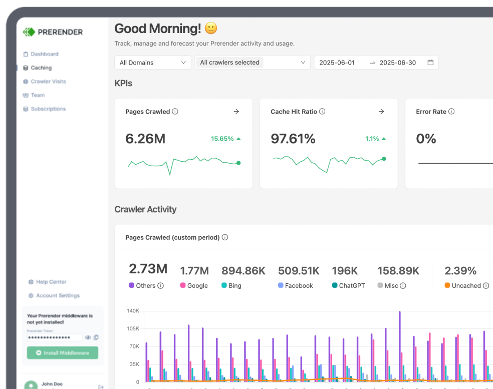
However, regarding AEO and SEO gains, using a solution like Prerender.io can help your pages score higher on Google Page Speed Insights, resolve most crawling, indexing, and rendering issues associated with JavaScript-heavy sites, and improve your AI search visibility without complex and expensive workarounds.
To use Prerender.io, all you need to do is install our middleware, so it can detect when Googlebot (or any other search, social, or AI crawler) accesses your site, and it’ll send a request to our servers. Prerender will then download all the necessary files, render your page, and create a snapshot of it to serve as a static HTML to the search engine. Here’s more about how Prerender.io works.
Although the first time it triggers this process can take a few seconds, Prerender.io will cache this snapshot and use it, from then on, every time a search engine requests the page. Turning JavaScript-heavy pages into instant, responsive, and fully rendered HTML.
Beyond a faster website, this has a host of unexpected benefits, such as optimized social media link previews, Google Ads that run smoothly, AI search visibility, and more.

| Pro Tip: Use Mobile Prerendering When users access your site from a mobile device, you want to serve them images with smaller file sizes, different layouts (like a different menu bar) to make navigation easier and data more suited for the vertical/small screen, and, in some cases, even slightly different content. The same thing should be done for mobile web crawlers, especially for search engines like Google that care so much about the mobile experience. For large brands, getting high Page Speed scores on mobile is a tough task, requiring many workarounds and compromises. However, for enterprises using Prerender.io, it is as simple as turning “mobile rendering” on in their account. This will allow us to create a different snapshot of your mobile website version and serve it to search crawlers when they access your site with a mobile user-agent. |
7. Use Browser Caching
Now that we mentioned caching, there’s a way you can leverage the browser’s cache to speed up your site speed from the second visit onwards.
The standard for controlling browser caching is the Cache-Control response headers, which your server or CDN sets when delivering files. Here’s a sensible setup for most JavaScript sites:
- # Static assets (JS, CSS, images). Safe to cache for 1 year
- # because bundlers add a content hash to filenames (e.g. main.a3f9c2.js)
- Cache-Control: public, max-age=31536000, immutable
- # HTML pages. Always revalidate so browsers pick up updated asset filenames
- Cache-Control: no-cache
The key insight here is that your bundler (Vite, webpack, etc.) adds a content hash to filenames like main.a3f9c2.js. Since the filename changes whenever the file changes, it’s completely safe to tell browsers to cache it for a full year. HTML is the exception. It should always be revalidated, since it’s how browsers discover updated asset filenames.
If you’re on a CDN like Cloudflare or a host like Vercel or Netlify, most of this is handled automatically. (Note: Prerender.io and Netlify have a partnership, so if you use Netlify and are interested in prerendering, it’s worth seeing how to leverage the extension.) But it’s worth verifying your headers with a tool like WebPageTest to confirm assets are actually being cached.
Going further is Service Workers. For more advanced caching or if you want your site to work offline, Service Workers are a standard approach. Using Google’s Workbox library, you can define caching strategies with just a few lines of config:
- Cache first for static assets: serve instantly from cache, update in the background
- Network first for dynamic content: try the network, fall back to cache if offline
- Stale-while-revalidate: serve the cached version immediately while fetching a fresh one in the background
Service Workers are particularly powerful for progressive web apps (PWAs), where the goal is a near-native mobile experience.
Wrapping Up: Other Mobile Optimization Practices to Keep In Mind
So far, we’ve focused mainly on JavaScript optimization. Still, many more factors influence the user experience on mobile. Here are a few more considerations worth implementing:
1. Prioritize above-the-fold content
This is the first content that appears on the user’s device screen. Prioritizing all resources needed to render this section first can provide a better experience to users and will ensure a better score on Pagespeed Insights.
2. Optimize your images
Images significantly impact your page’s file size and, thus, your site’s speed. Make sure your team is using the correct practices:
- For big images, try to hit 150 KB to 500 KB, and make sure to compress them with tools like https://tinypng.com/
- Don’t serve images larger than the screen can actually display; users won’t be able to appreciate them, and their phones will need more network bandwidth to deal with them
- Convert PNGs to WebP or AVIF wherever possible. WebP files are around 33% lighter than JPGs, and AVIF can be a further 30–50% smaller than WebP. Tools like Squoosh or an image-optimizing CDN can do this automatically.
- Lazy load your images to allow the page to become interactive faster and make the browser download visual assets only when they’re needed
3. Use media queries
Media queries are responsive CSS rules that allow you to control how your page renders based on the user’s device, creating a responsive experience across all screen sizes, including mobile devices.
For example, you can use a media query to tell the browser to hide a specific element on the phone or to make the font size adapt to the screen, so it’s always easy to read the page’s content.
Here’s an example from W3bschool:
“If the browser window is 600px or smaller, the background color will be light blue:”
| @media only screen and (max-width: 600px) { body { background-color: lightblue; } } |
Although this tutorial was focused on JavaScript sites, there are many other “general” best practices to help you build the best mobile-friendly site and application possible.
If you’d like to keep exploring a few more recommendations, here are 10 more tips to build a mobile-friendly website from scratch. These tips will help you make your site more responsive, faster, and SEO friendly.
Ready to see how prerendering your JavaScript site will help? Join 100,000+ brands like Salesforce, HubSpot, and Figma and integrate with Prerender.io today. You can enjoy a free 30-day trial, no credit card or code changes required, to see how it works for you.