It takes a lot of hard work and dedication—from research to writing and editing—to create a piece of great, sharable content. (It’s too bad if all your great efforts just sit idly after hitting the publish button.)
To get the attention of your ideal audience, you should be actively sharing and promoting your content outside of your website, like on social media. Proper amplification is key to success—it brings some traffic to the page while you wait for SEO to kick in and helps your overall content performance.
When people see, interact, and share your content, you help search engines find your pages faster and provide positive signals of authority, acting as a sign of trustworthiness and helping your SEO strategy.
Although we’ve already talked about this topic in our detailed Open Graphs guide, this time, we want to focus on Twitter Cards and their benefits for your content amplification strategy. We’ll also show you how to create your own cards and implement them on your single-page applications and dynamic pages.
What are Twitter Cards?
A Twitter Card is an interactive element embedded within a tweet, allowing you to display content summaries, images, videos, and CTAs users can interact with without leaving Twitter.
These cards are generated from Twitter Card tags added to the heading of a page.

In the example above, you can see how Twitter generates a card showing a large image, the domain, the title of the article, and a short description.
Using Twitter Cards is not just about aesthetics. According to most sources and Twitter themselves: “tweets with cards have 43% higher engagement rates than regular tweets with links”.
By converting your links into rich elements within Twitter, you increase your click-through rate (CTR), engagement rate, and overall content reach within the platform, ultimately increasing visibility.
Note: Although high social media engagement is not a ranking factor, search engines do crawl social platforms. Increasing social shares and engagement can potentially lead to faster indexation (as Google is able to find your pages), and high engagement is a signal of trustworthiness for your page.
| Twitter Cards vs. Open Graph Tags: Twitter Card tags are based on the same convention as the Open Graph (OG) Protocol, so their syntax is nearly the same. The main difference is that Twitter Card tags were designed to work directly with Twitter, so its crawler will look first for these tags and only use OG tags as a fallback. Still, Twitter Card tags give you more control over the type of card you can generate for your page, so whenever possible, use these to increase your engagement on Twitter. |
Creating Your Twitter Cards: Code Snippets and Examples
Now that you have a better idea of why it is worth it to make this effort, let’s explore the four different types of Twitter Cards you can use and how to create them:
Summary Card
This Twitter Card shows a small image on the left and the metadata of your page on the right.
Since the illustration is small, many people feel it is rather ineffective in grabbing readers’ attention.
That’s why the other type of Summary Card (explained next) is more popular than this type.
Nevertheless, this Summary Card type still provides a rich snippet of your content well.

To generate a Summary Card for your page, you can use the following template:
| <meta name=”twitter:card” content=”summary”> <meta name=”twitter:site” content=”@twitterhandle”> <meta name=”twitter:title” content=”The title you want to get displayed on the card”> <meta name=”twitter:description” content=”A description of the page’s content”> <meta name=”twitter:image” content=”The URL of the image you want to display on the card”> <meta name=”twitter:image:alt” content=”Alternative text assigned to the image for screen readers”> |
Note: Every card uses a slightly different syntax, so don’t use the same template when generating a different card. If you want to use this type of card, use square images to avoid getting it cropped, and keep the resolution between 144×144 and 4096×4096 pixels.
Summary Card with a Large Image
Just as its name suggests, this Summary Card shows a larger image, taking more real estate in the feed.
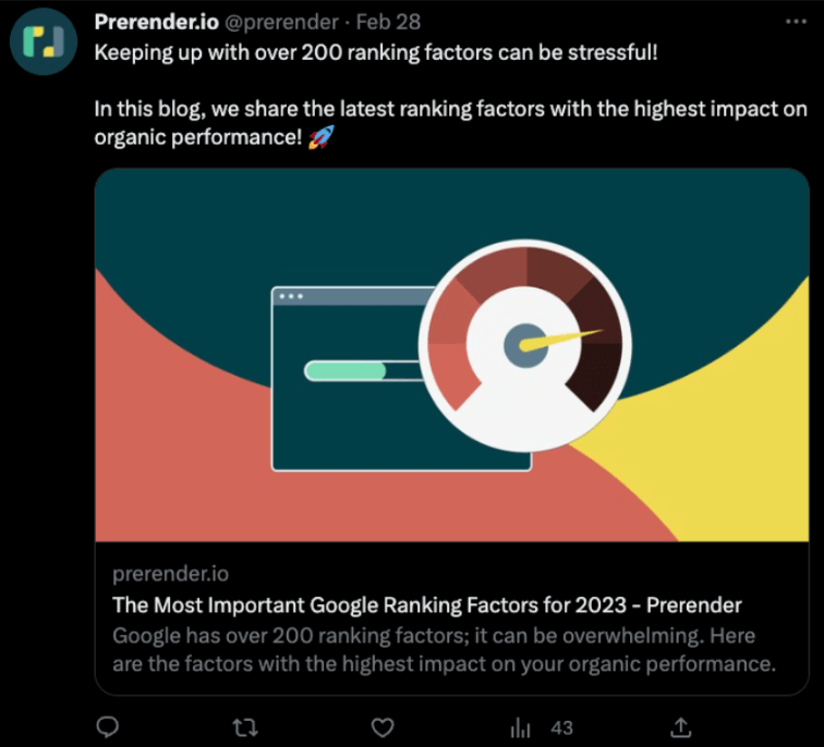
To generate a summary with large image card for your page, you can use the following template:
| <meta name=”twitter:card” content=”summary_large_image”> <meta name=”twitter:site” content=”@twitterhandle”> <meta name=”twitter:creator” content=”@userNameOfTheCreator”> <meta name=”twitter:title” content=”The title you want to get displayed on the card”> <meta name=”twitter:description” content=”A description of the page’s content”> <meta name=”twitter:image” content=”The URL of the image you want to display on the card”> <meta name=”twitter:image:alt” content=”Alternative text assigned to the image for screen readers”> |
Note: The twitter:creator tag specified a user handle instead of the website’s handle. Make sure you’re using a 2:1 ratio for your image and keep the file size lower than 5MBs. This type of card is best used if you have an attention-grabbing illustration to generate undivided attention to your tweet.
Player Cards
This type of card allows you to embed playable media like videos and audio directly into your tweet, so people can interact and consume your content without having to leave the website or app.
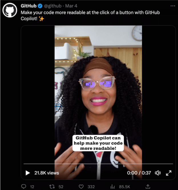
Player Cards are great for bringing more eyes to your YouTube videos, podcast episodes, and other non-static content. Because of the interactiveness it offers, Player Cards generally generate more engagement than other Twitter Card types. Consequently, it brings more opportunities to spread your message to more users and potential customers.
To generate a Player Card for your page, you can use the following template:
| <meta name=”twitter:card” content=”player”> <meta name=”twitter:site” content=””@twitterhandle”> <meta name=”twitter:description” content=”A description of the page’s video or audio content”><meta name=”twitter:image” content=”The URL of an image to be used in place of the player on some platforms where iframes or inline players are not supported”> <meta name=”twitter:player” content=”HTTPS URL to iFrame player”> <meta name=”twitter:player:width” content=”Width of the player in pixels, e.g. 480″> <meta name=”twitter:player:height” content=”Height of the player in pixels, e.g. 480″> |
However, depending on the source of the attached media, there are some rules that you need to follow when implementing the Player Card. Here are Twitter’s instructions to ensure a working Player Card:
- Unzip the contents into a publicly accessible path on your website
- Open the index.html file and ensure the twitter:image and twitter:player values point to your server and file locations
- Ensure all paths are specified as secure (https://)
In most cases, you won’t have to worry about this, as people usually share this content from 3rd-party platforms like YouTube and Spotify, which have already implemented their own Twitter tags.
Still, if you are streaming your own video/audio content or have content that can only be found on your website, this is the card you’re looking for.
App Card
Did you guess what this card does?
It allows you to promote an application, including an install button at the bottom to win over more users.
The App Card doesn’t amplify content per se, but it’s still worth mentioning here.

You can learn the nuances of using this card in detail from Twitter’s documentation.
That being said, to generate an App Card, you can use the following template:
| <meta name=”twitter:card” content=”app”> <meta name=”twitter:site” content=”@twitterhandle”> <meta name=”twitter:description” content=”This is the description of your app.”> <meta name=”twitter:app:country” content=”Country, e.g. US”><!– Iphone –> <meta name=”twitter:app:name:iphone” content=”Name of the app”> <meta name=”twitter:app:id:iphone” content=”App ID”> <meta name=”twitter:app:url:iphone” content=”URL to the app in the app store”> <!– Ipad –> <meta name=”twitter:app:name:ipad” content=”Name of the App”> <meta name=”twitter:app:id:ipad” content=”App ID”> <meta name=”twitter:app:url:ipad” content=”URL to the app in the app store”> <!– Android –> <meta name=”twitter:app:name:googleplay” content=”App’s name”> <meta name=”twitter:app:id:googleplay” content=”App’s ID in googleplay”> <meta name=”twitter:app:url:googleplay” content=”URL of the app in googleplay”> |
How to Implement Your Twitter Cards
The implementation of Twitter tags is slightly different based on how you’ve built your website:
- WordPress websites can use an SEO plugin like Yoast, which lets you set these tags within its social tab. Once the values are specified, Yoast will add the corresponding Twitter tags in the HTML head section.
- SquareSpace websites generate these tags automatically using the metadata of your page (title, meta description, and featured image) – it is set to summary by default, but you can inject your own code to overwrite this.
- Webflow lets you set your own Open Graph tags, but there’s no option for Twitter Card customization. Still, you are able to add custom code to your page, so a workaround would be to add your Twitter tags to the head section through the editor.
- To add Twitter Cards to an HTML website, add the Twitter tags to the head section of your page, as you would add any other meta tag.
When it comes to adding these tags to JavaScript websites (like single-page applications), the process is a little bit trickier than that. For example, when you share a link to one of your pages in a tweet, Twitter will crawl your page to collect the necessary information to generate the card. However, if you’re using a JavaScript framework, the initial response received by Twitter crawlers is actually a blank page. The “content” only gets populated with HTML content on rendering time.
Generally speaking, it is still impossible for social crawlers to execute JavaScript code. This means that Twitter won’t be able to see your tags and, thus, won’t generate interactive elements in the tweet.
Enable Rich Link Previews and Interactive Tweets with Prerender.io
As you can imagine, this problem won’t just affect Twitter Cards, but other social media platforms won’t be able to fetch your Open Graph tags either, crippling your content amplification efforts.
Before you lose all hope and start re-writing your website on Next.js, use Prerender to enable rich previews on all social media platforms and messaging apps (e.g., Whatsapp)!
Prerender takes your page and generates a fully-rendered, functional version of it in plain HTML, and when a social crawler requests your page, it will send this cached version as a static HTML response. Read on for details on how Prerender.io optimizes your link previews.
Now, because all your content (including meta tags, links, text, images, and interactive elements) is already rendered, social crawlers will find all your tags without any delay. All you have to do is just install Prerender in your site’s backend and enjoy all the SEO and social media benefits of HTML websites without sacrificing the conversion rate and user experience that only dynamic pages can provide.
| “After barely launching our SPA, we realized we needed a solution to show up in search engines and on social media previews. Prerender solved that.” Source: Capterra |
Resource: Learn how Prerender works
Validate Your Twitter
Once your code is in place and Prerender is installed – in case your website requires dynamic rendering – it’s time to ensure everything is working properly. To validate your tags, navigate to https://www.bannerbear.com/tools/twitter-card-preview-tool/ or the Twitter Card validator of preference and enter your URL. If the tags are working and accessible, you’ll see a preview of your card:
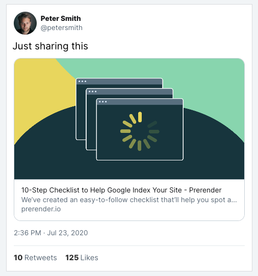
Note: Twitter has its own card validator, which we encourage you to use, but at the moment of writing, the service is down. Don’t be afraid to use other alternatives or test your links right from the Twitter app.
Final Considerations
Twitter never sleeps.
You and your competitors are battling to grab your target audiences’ attention. And using Twitter Cards is no longer an upper hand but a standard practice every website implements to avoid getting buried in the feed.
To stand out from other tweets, stop using the same copy as the rest of your meta tags and think of your cards as little ads.
Here are some strategies to make your Twitter Cards more captivating:
- Design a custom image – most websites use the featured image on their links, which is not optimal for social media. Think of your card’s image as a thumbnail, and play with a combination of visuals and CTA to attract people’s eyes.
- Make your title catchy – titles are crucial for CTR, so think of ways to make them more attractive. Remember, most people on social media are just scrolling, so your title should be powerful enough to entice a click or to make them save the tweet for later.
- Show the value of the link in the description – most companies use the description, like a summary, which is just a waste of potential. Use your descriptions to show the value customers will get after reading your page, and do it in 100 – 150 characters or less.
- Share your video and audio content from your website – this may be a controversial one, but why bring traffic to a 3rd-party website and not to your own website? Give every video and podcast episode a place on your website, and share the link with the Player Card to gain some extra exposure for your domain.
We hope this guide is helpful and you can quickly set up the correct Twitter Cards for your pages. If you have any questions, find us on Twitter, LinkedIn, or YouTube and we’ll help!
FAQs
TL;DR: What Are Twitter Cards and How Do They Work?
Twitter Cards are interactive elements embedded within tweets that allow you to display content summaries, images, videos, and call-to-actions (CTAs). They enhance the visual appeal of your tweets and provide additional information to engage users—without them leaving Twitter.
Why Should I Use Twitter Cards?
Implementing Twitter Cards can increase your content’s visibility and engagement on Twitter. Some sources say that tweets with cards receive up to 300% more engagement than ones without. This means more interactions, shares, and potential traffic to your website.
How Can I Implement Twitter Cards on My Website?
To add Twitter Cards to your website, you need to include specific meta tags in the head section of your HTML. These tags define the type of card and the content to display, such as the title, description, and image. Once added, you can validate your implementation using Twitter’s Card Validator tool.
What Types of Twitter Cards Are Available?
There are several types of Twitter Cards you can use, including Summary Cards, Summary Cards with Large Image, App Cards, and Player Cards. Each serves a different purpose, allowing you to choose the format that best showcases your content.
How Do Twitter Cards Affect My Website’s SEO?
While Twitter Cards themselves do not directly influence search engine rankings, they enhance your content’s visibility and engagement on Twitter. This increased interaction can lead to more shares and backlinks, indirectly benefiting your SEO efforts.


