
With the mobile-first indexing rollout, Google has made significant changes to its indexing process to ensure that mobile users have a better experience when searching online. While this is an achievable step on standard HTML websites, what does this mean for websites that rely heavily on JavaScript for functionality?
In today’s SEO guide, we will explore the meaning of Google mobile-first indexing (including for JavaScript), how you can take advantage of this new format, and the challenges you’ll need to overcome to maintain the SEO performance of your site, both on their mobile and desktop versions.
What is Mobile-First Indexing?
Mobile-first indexing refers to a shift in the priority of content indexation. But before we can explain what has changed in this indexing rollout, it’s crucial to understand how Google’s indexing process has worked so far.
Without getting into too many details about crawling (which you can learn more about in our indexing process breakdown), Google can request your pages through two user agents: Googlebot desktop and Googlebot mobile.
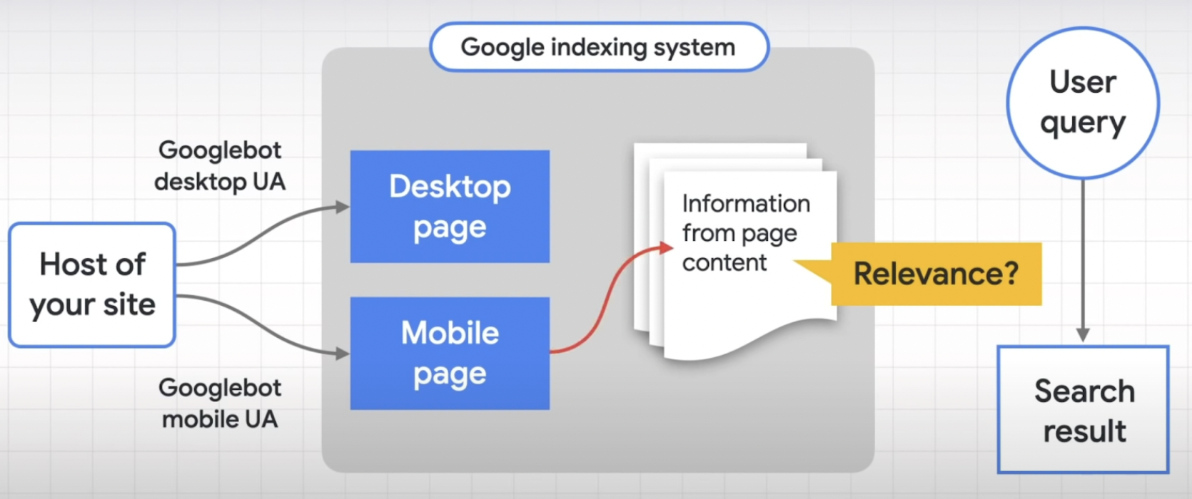
Source: Google’s Documentation
When a crawler finds your pages, it doesn’t need to take the information from both versions because these are supposed to be identical pages. Instead, it only takes into account one version and adds that content to its index. This is why it was a desktop-first approach to indexation.
Now, that is not the case.
The shift to mobile-first indexing means that mobile versions are the ones getting indexed and evaluated. And based on your mobile site’s performance, both desktop and mobile versions will be ranked in the search engine result pages (SERPs).
(Note: This does not mean that there are two different indexes. It means that, no matter if your desktop’s SEO is on point, if your mobile site is lacking, you’ll be judged by that results.)
The use of mobile devices to access the internet has skyrocketed. According to Statista, mobile devices generate up to 59.16% of global online traffic. No wonder mobile has now become the benchmark of Google’s indexing approach and an important SEO factor.
Now, mobile-first indexing may not sound like much, but for websites showing less content on mobile or performing poorly on mobile optimization (especially those that are built with JavaScript frameworks), it means lower rankings and a big shift in position across the SERPs.
By providing great user experience (UX) and content on both versions, you have more opportunities to grow their organic performance and secure their positions.
Can the Quality of My Mobile Site Affect My Website Ranking?
Yes. As mentioned before, Google now uses the mobile version of your website as the primary measure of its overall quality. This means a poor mobile experience can negatively impact your website’s ranking, even if your desktop version is optimized and performing well based on Google ranking factors. Google’s focus on mobile-first indexing makes mobile site quality crucial for overall search visibility.
General Challenges with Mobile-First Indexing
While mobile-first indexing is a positive step towards reflecting how users access websites, it presents some challenges for website owners and SEO professionals. Here’s a breakdown of the key hurdles:
- Missing content: websites might have different content on their desktop and mobile versions. If the mobile version lacks crucial content compared to the desktop version, Google might prioritize the desktop content for indexing, potentially harming your mobile ranking.
- Structured data: ensuring proper structured data implementation is crucial for mobile-first indexing. Structured data helps search engines understand the content and context of your mobile pages.
- Testing tools: utilizing mobile-specific testing tools can help identify crawl and indexing issues specific to the mobile version of your website.
- Click depth: mobile users are less likely to click through multiple pages compared to desktop users. This can make it harder for Google to understand the structure and hierarchy of your website’s content.
- Slow loading speeds: mobile devices often have weaker connections compared to desktops. If your website is slow to load on mobile, it can negatively impact crawl budget and indexing.
- Unoptimized images and videos: large, unoptimized images and videos can significantly slow down mobile load times. Google prioritizes mobile experience, so such issues can affect indexing.
If your site has JavaScript elements, the story is a little more complicated.
JavaScript Mobile-First Indexing Challenges
Google has to take things a step further when it comes to JS.
How? Well, before Google can actually visualize the page’s content, the crawler will send the URL to a renderer component. This renderer uses an evergreen instance of Chrome and Puppeteer to download all necessary resources (HTML, CSS, JavaScript files, etc.) to render the page.
In the past, we’ve learned that JavaScript takes 9X longer to crawl and index than its static counterparts (desktop). With mobile, it’s worse. Googlebot tries to mimic a common mobile user, giving you even less resources to handle your dynamic content and get indexed.
In addition, mobile devices have their own limitations that’ll take a toll on your page speed and core web vitals (CWVs) scores:
-
- Mobile devices have less processing power than desktops, taking it longer to render your page.
- They don’t always count with the best internet connection, so downloading your files takes longer, impacting your core web vitals.
- Mobile devices can’t multithread, so render-blocking resources like JavaScript are harder to handle.
We’ve discussed several strategies you could implement to optimize your mobile JavaScript performance, but there’s only so much you can optimize before hitting the ceiling. The good news is that not everything is a con.
SPAs and JS-based websites can take this as an opportunity to take on the competition by using a dynamic rendering solution like Prerender.
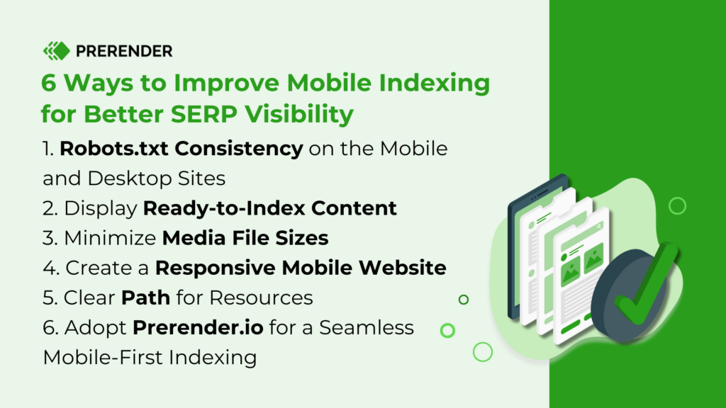
6 Ways to Improve Mobile Indexing for Better Indexing and SERP Visibility
For Google to understand and rank your mobile website properly, it needs to access and render all your content and resources.
Here’s how to ensure a smooth experience for Google bots.