
Optimizing media files (images, videos, and product page content) is crucial for SEO. Techniques like structured data, sitemaps, and alt text help Google crawl and understand your website. However, for JavaScript-heavy sites and Single-Page Applications (SPAs), these basic SEO optimization techniques might not be enough.
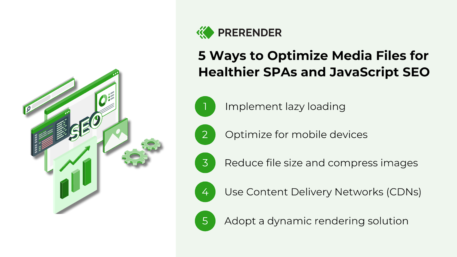
In this guide, we’ll explore other media optimization strategies specific to JavaScript-heavy sites and SPAs, including CDNs, lazy loading, and mobile optimization. How to do them properly? Read more to find out.
1. Implement Lazy-Loading
The first SEO strategy to optimize your JavaScript-generated media is lazy loading.
Lazy loading is a media optimization technique that only loads content that users see first. So, instead of loading all images on the page immediately, lazy loading waits until an image enters a user’s viewport (the visible area of the browser window). This means users will see the most important content right away, and will discover more as they scroll down.
There are two main benefits of using lazy loading:
- Faster loading times: by delaying non-essential media loading, lazy loading significantly improves initial page load speed while keeping users engaged.
- Data savings: users with limited bandwidth can browse your site without unnecessary data consumption.
Here is how to implement lazy loading to your JS sites.
How to Lazy Load Images
Option 1: Browser-Level Lazy Loading
This means adding the ‘Loading’ attribute to your <img> tag. The browser will automatically handle lazy loading by fetching the image only when it’s about to be displayed in the viewport.
| <img src=”sampleimage.jpg” alt=”Description” loading=”lazy” width=”200″ height=”200″> |
You can also use the ‘Loading’ attribute with the <picture> tag. However, you can only add the attribute to the fallback <img> element, not the <picture> — and the browser will still choose the image to load until it’s close to the viewport.
| <picture> <source media=”(min-width: 800px)” srcset=”dogimg.jpg 1x, largerdogimg.jpg 2x”> <img src=”picture.jpg” loading=”lazy”> </picture> |
It is important to note that although this method is quick, easy, and attractive for JavaScript-heavy sites, only Google Chrome and Firefox support it now.
Option 2: Use JavaScript Event Handlers
Without the browser-level lazy loading shown above, your browser would automatically load all images it finds in your ‘src’ attribute. To prevent this, put the URL in placeholder attributes like ‘dat-src’ and ‘data-srcset.’ Then, use event handlers like scroll-event, orientation ChangeEvent, and Resize to listen for viewport changes.
When the viewport changes, the distance between the user and the image is calculated. If the lazy-loaded image is inside the viewport, the URL is taken from ‘data-src’ and added to ‘src,’ and then the full image shows.
Here’s a sample code from Imagekit. The first three images are not lazily loaded, but the rest are. As soon as the fourth image gets into your viewport, it loads, and the same scenario applies as you scroll down further.
Option 3: Use Intersection Observer API
This method is a refined version of the JavaScript event handlers. Instead of guessing when the image will be in the user’s viewport, the API has been pre-written to attach an observer to all lazy-loaded images.
It monitors all the unloaded images. When it detects an image in a user’s viewport, you use the intersecting property to pick up the image from the ‘data-src’ attribute and move it to ‘src.’ Consequently, this will trigger a load, and the observer will be detached from the image.
Take this sample code as an example of lazy-load using intersection observer API. Looking closely, you’ll see that the Intersection observer API is slightly faster than the event handler.
However, not all browsers support them. So, it’s best practice to combine it for lazy loading.
How to Lazy Load Videos
Use Native Lazy Loading
This is very similar to the browser-level lazy loading of images. It’s as simple as adding a preload attribute set to none. This method is used for videos that shouldn’t play automatically.
| <video controls preload=”none” poster=”one-does-not-simply-placeholder.jpg”> <source src=”one-does-not-simply.webm” type=”video/webm”> <source src=”one-does-not-simply.mp4″ type=”video/mp4″> </video> |
The poster attribute takes the value of a placeholder to occupy the space until the video loads. You can kill two birds with one stone here by using the actual thumbnail image as the placeholder, so it’s not too obvious you’re lazy loading.
That said, the preload attribute has a drawback: it prevents ALL video data from loading, including the meta. We recommend setting the value of preload explicitly because different browsers and versions behave differently.
2. Optimization for Mobile Users
In 2020, Google introduced its mobile-first indexing. This means that Google will determine your content information and ranking based on the mobile version of your website. If your media isn’t optimized for mobile, it will negatively impact your Core Web Vital scores and SERP visibility.
Related: Learn how to improve your Core Web Vital scores by following these easy tips.
Now, to optimize your media for mobile users and Google crawlers, we recommend using responsive design. Responsive design ensures your media adapts seamlessly to various screen sizes and resolutions. This means mobile users encounter a website that adjusts perfectly to their device, eliminating the need for zooming or scrolling horizontally.
Here’s how to optimize your mobile web media for better JavaScript SEO scores.
Images: Use Responsive Media Attributes
Apply responsive media like ‘srcset,’ ‘sizes,’ and <picture> <source> attributes in your HTML. These attributes will provide different image sizes and resolutions for different viewports so that the search engines can search for the right version of the image for the right device.
Videos and Infographics: Use CSS and Flexible Grid Layouts
CSS media queries and flexible grid layouts handle responsive designs. They allow videos to resize no matter the device the user uses. For infographics, they ensure that the user does not need excessive zooming or scrolling to access the content.
Audio Files and Documents: Compress The Size
Audio files and documents do not require much mobile-specific optimization. Ensure they are sized properly and compressed to reduce latency, and you’re good to go.
3. Media File Size Optimization and Compression
Page load speed is one of the metrics involved in SEO ranking pages. Allowing other content (like texts) to load first and then loading the media is a great way to maintain high page speed.
There are a lot of compression techniques that can be applied to media. Two examples of them are:
- Lossy compression: This technique sacrifices some media quality for smaller file sizes.
- Lossless compression: This technique saves the media quality but doesn’t reduce the size by that much.
Here’s how to optimize your media compression for better JavaScript SEO health based on the media types
Images: Pick the Best Image Format
Optimizing images for file type, size, dimensions, and format can improve page speed, user experience, and search visibility in Google Images. One of the easiest ways to achieve this is by choosing the right image format:
- JPEG is great for blog posts and images where page speed is prioritized.
- PNGs/SVGs for images that demand higher quality. SVGs are also great for product images because they are lightweight and responsive.
- AVIF is a modern image format that offers great compression and quality compared to older formats, but it is not supported in all browsers.
Videos: Host Them on a Third-Party Platform
Hosting videos on YouTube or Vimeo instead of on your website can indirectly improve Page Speed. Third-party platforms have built-in optimization systems that play videos and reduce page load time.
Audio Files: Choose the Right Format
Audio files such as podcasts, music, and sound effects can boost user experience while browsing your JavaScript websites or SPAs and provide additional information. Compressing audio files to formats like MP3, AAC, and Opus can reduce file sizes while maintaining an acceptable quality level.
Infographics: Compress Them Without Hurting the Quality
Infographics appealingly deliver complex messages, boosting backlinks and search visibility. Optimizing infographic formats and sizes will also boost load times.
The three most common Infographics formats are JPEG, GIF, and PNG. JPEGs are great because they can be compressed while maintaining image quality.
Interactive Media: Minimize the JS and CSS Codes
Interactive Media such as quizzes, polls, and calculators often depend on Javascript and CSS files, which can be optimized by minimizing Javascript and CSS.
Documents: Delete Unnecessary Metadata
PDFs and slide decks should be compressed by removing unnecessary metadata and compressing images.
4. Use Content Delivery Networks (CDNs)
We’ve explored how reducing media size can improve website performance. But there’s another crucial factor: the distance data travels. This is where Content Delivery Networks (CDNs) come in.
For instance, Amazon perfectly optimizes all its media but only has one server in New York. Someone in Los Angeles tries to access the site. What happens? Long distance, long wait. The data has to travel a vast distance, resulting in high latency and slow loading times. This translates to a frustrating user experience.
A CDN is a network of servers strategically located around the globe. When a user requests content from your website, the CDN delivers it from the closest server, significantly reducing the travel distance and page speed. Additionally, CDN also helps increase content delivery rates, reduce the load on the original server, and protect data by employing rate limiting and IP blocking.
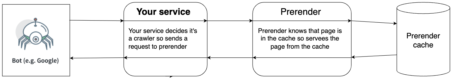
5. Adopt a Dynamic Rendering Solution
Besides implementing lazy loading, optimizing the media files for mobile devices, and compressing their sizes, there’s another JavaScript SEO optimization technique that can help you achieve 260% faster indexing and 300x better crawling: dynamic rendering with Prerender.
Prerender transforms your JavaScript pages into their static HTML version, caches them, and feeds these ready-to-index files to search engine crawlers whenever they request them. As for human user requests, they will be directed to your server’s normal route, allowing them to experience the fully interactive dynamic JS websites. This smart way to recognize and process user agent requests made the dynamic in dynamic rendering.
Here’s an illustration to give you a better understanding of how Prerender works. Learn more about Prerender and dynamic rendering here.
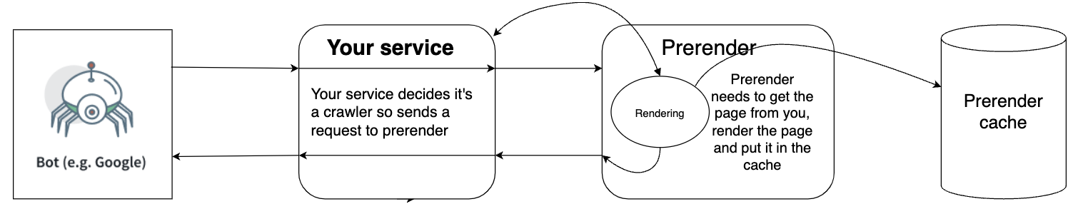
Prerender renders and caches your pages
Prerender serves the cache to crawlers
Now, what benefits do you get from Prerender’s dynamic rendering of your media files? Since Prerender saves the snapshot of your content, it significantly cuts the crawling process time and saves your server power to answer such requests. This means that only Google can better understand your content and media, but it can also indirectly improve your PageSpeed scores, resulting in better SERP rankings and healthier SEO results.
Optimize Your Media Files for Healthier JavaScript SEO
Media files are a powerful tool for engaging users and enhancing website comprehension. However, for websites built with JavaScript or SPAs, unoptimized media can hinder SEO by making it difficult for search engines to crawl and index your content.
This is why you need to optimize your site’s media data. Implementing the abovementioned techniques will significantly improve your media’s visibility in search results.
For even greater impact, explore advanced solutions like pre-rendering with Prerender. This technique allows search engines to access and understand your content, even if it’s heavily reliant on JavaScript. The result? A significant boost in your website’s SEO potential.Sign up to Prerender today and get 1,000 FREE rendering credits.