Smartphones now drive over 78% of all ecommerce traffic. This massive mobile shift presents golden opportunities for online retailers, but it also comes with significant challenges.
Unfortunately, many ecommerce sites haven’t adapted to mobile shoppers. These sites often suffer from mobile user experience issues, such as slow load times, cluttered layouts, and convoluted checkout processes—all of which can lead to frustration and lost sales.
In this article, we’ll explore practical tips to optimize your ecommerce site’s mobile user experience (UX) to help you convert one-time shoppers into repeat customers.
What Is Mobile UX, and Why Is It Important for Ecommerce?
UX, or User Experience, refers to the overall experience a user has when interacting with a product, service, or system. It encompasses all aspects of the user’s interaction, including the design, usability, accessibility, and overall satisfaction with the product or service.
Having user-centric mobile UX brings several benefits to your retail business, for example:
- Optimized ecommerce mobile UX can significantly improve conversion rates, whether it’s making a purchase, signing up for a service, or completing any desired action.
- A positive user experience leads to higher satisfaction rates, which can translate into increased customer loyalty, positive word-of-mouth, and, ultimately, business growth.
- Good UX considers users with diverse abilities and needs, ensuring that products and services are accessible to the widest possible audience.
- A seamless, enjoyable user experience can positively impact a brand’s perception, positioning it as user-centric and trustworthy.
Pro tip: While improving mobile UX is vital for ecommerce sales, auditing your ecommerce SEO can also help boost rankings and traffic. Learn key areas you should focus on when auditing your ecommerce site.
8 Ways To Improve Your Ecommerce Mobile UX
Here are some simple approaches to improve customer experience on your site.
1. Understand Your Target Audience
Understanding your mobile customers is key to starting the design process for your mobile site.
Use surveys and public forums to uncover your customers’ shopping behaviors, pain points, and motivations. Collect both the positives (to know what aspects are effective) and the negatives (to identify areas for improvement) of your online store. Then, walk in your customers’ shoes, experiencing your retail site’s UX as they do.
Finally, transform the customer’s feedback into solutions. The better you understand your users, the easier it will be to build a UX online store that performs well and increases overall user satisfaction.
2. Optimize Your Site for Mobile First
You find an amazing product in an online store. When you attempt to click on the “Add to Cart” button, the button is too small to tap, forcing you to zoom in and out just to navigate. This experience is frustrating, isn’t it? That’s where responsive mobile UX design comes to the rescue.
Focus on streamlining key tasks like browsing products, adding items to the cart, and checkout. Make sure text is readable, images are appropriately sized, and buttons have sufficiently large tap targets for fingertips.
It is recommended to start with a mobile-first approach in the site’s UX initial planning because scaling up to the desktop is easier than the other way around.
Moreover, search engines like Google prioritize the mobile version of websites for indexing. If a site doesn’t adapt well to mobile screens, vital pages may not be crawled properly, reducing traffic and visibility on SERPs. Learn more about Google’s mobile-first indexing approach and the SEO strategy you should adopt to support it here.
Optimizing your mobile site for a seamless user experience and SEO dominance is crucial in today’s mobile-driven world. But what about those pesky web page indexing issues slowing you down? Prerender, a technical SEO tool, tackles them head-on while you focus on mobile optimization. This ensures all your pages are search-engine-ready, maximizing your chances of mobile shopping success.
3. Simplified Navigation
Most users want smooth interactions when shopping on mobile, and they will jump ship at the first hint of clutter or confusion. To improve user retention, you have to simplify your mobile UX, starting with having only the most important pages in your main menu.
Unlike your desktop version, you have to streamline the shopping experience so that your users don’t get sidetracked exploring your site. This may mean removing unnecessary desktop features/pages from your front page menu.
For a streamlined mobile UX, secondary or less frequently used options should be reserved for neat “hamburger” menus, preventing information overload and decision fatigue.
Additionally, navigating your mobile ecommerce site should be effortless. Use clear language to communicate expectations/instructions and large, readable fonts without zooming. Consider an image-based navigation menu for a smoother experience.
By providing intuitive navigation that reduces excessive scrolling and clicking, you boost user engagement metrics like bounce rate and time on page, which Google considers for SERPs rankings.
Related: Discover the 5 most important Google ranking factors to help rank your ecommerce product here.
4. Prioritize Fast Page Loading Speeds
Google loves a fast-loading website—and so do your users. PageSpeed has been a Google ranking factor since 2010, and it became even more important after the 2018 mobile-first indexing update. However, because most ecommerce websites use JavaScript dynamic content, they are notoriously slow, which negatively affects mobile UX.
Slow pages also hurt Core Web Vitals and PageSpeed scores. According to Google, bounce rates increase by 32% when page load takes 1 to 3 seconds and 90% at 5 seconds. High bounce signals to search engines that your content is irrelevant, lowering click-through rates for your pages and negatively impacting your rankings.
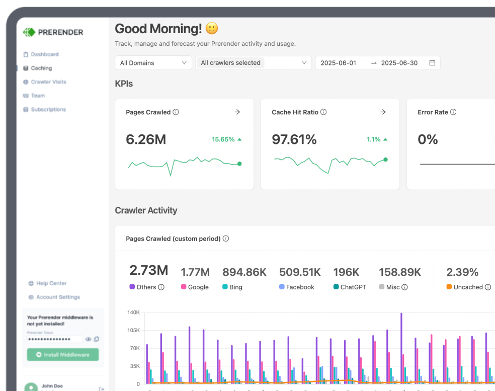
To increase the server response time (which will boost the PageSpeed score) of your ecommerce platform, use Prerender. We cache and feed fully rendered versions of your ecommerce JS-based pages to search engine bots and users alike. Not only does this improve server response speed but also your website’s crawling and indexing performance—all of which help boost your SERP ranking.
Also, check out these tips to increase page speed to boost your website performance quickly.
5. Personalized Product Recommendations
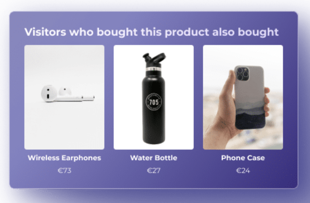
One underrated hack of successful ecommerce platforms is a personalized experience. Offering generic product recommendations isn’t enough. Instead, personalized product recommendations guide your customers to the products they will most likely buy.
You can dynamically change the content your customer sees on their homepage based on previous purchases or display “people also buy” suggestions at the checkout.
The placement and format of your product recommendations significantly influence how your customers perceive and engage with them. So remember, you want to present them in a way that is relevant, helpful, and non-intrusive while simultaneously capturing the user’s attention and curiosity. Learn more about the product recommendation engine for ecommerce here.
6. Easy and Secure Checkout
A smooth checkout encourages customers to complete their purchases. Here are some tips to help your customers have a hassle-free checkout experience:
- Be upfront about shipping fees and taxes so customers know the situation.
- Have a guest checkout option for those not interested in creating accounts.
- Reassure customers their purchase went through with a “Thank You” page and build trust with verification-shop seals.
- Provide diverse payment options like PayPal, Amazon, and Buy-Now-Pay-Later services to accommodate customer preferences.
7. Improve Customer Service
Happy customers don’t just keep coming back, they become your biggest advocates. When you deliver exceptional customer service, it creates a memorable experience that people love to share. Positive reviews on websites and social media posts singing your praises—that’s free word-of-mouth advertising at its finest!
E-commerce stores can enhance their customer service in several ways, such as:
- Sending automated emails to update shoppers on order status and delivery.
- Offering order tracking to show transparency.
- Provide live chat services to answer questions in real-time, making shoppers feel heard.
8. Create an Omnichannel Experience
While optimizing the user experience on your ecommerce mobile site is foundational, today’s customers want shopping experiences beyond a single website. Therefore, integrating ecommerce into social media enables seamless browsing and increases purchases and conversions.
By embracing various channels, from social selling (e.g., from Instagram shopping feature or TikTok) to pop-ups, you increase brand awareness and offer enjoyable purchasing experiences across multiple touchpoints.
The idea is to create a uniform commerce experience across platforms, which will drive more sales through more visibility and customer engagement.
Increase Ecommerce Sales Through Better Mobile UX
Just like desktop, first impressions are crucial on mobile. That’s why optimizing your mobile UX should be a top priority for your ecommerce business.
To know if your UX is positively affecting your sales, track your customer conversion rates and key performance indicators (KPIs) after each UX adjustment. This data-driven approach helps you identify strategies that drive positive results and maximize your mobile success.
Now, if you want to further improve your modern retail website’s performance, factor in JavaScript dynamic rendering so search engine bots can quickly process and index it. Register now with Prerender for free to get started.


